There’s something about fall that brings out a different kind of creativity, right? The colors get warmer, textures feel cozier, and suddenly even a simple plaid looks like it belongs in an art gallery.
Whether you’re a designer, artist, crafter, or small business owner making seasonal products, fall patterns are your secret weapon for creating instant emotion. It is mix of nostalgia, comfort, and crisp new beginnings.
Over the last few years, I’ve seen so many clever ways people bring fall themes into their work, all from textile designers who reinvent the classics to illustrators turning leaves into geometric masterpieces.
Let’s talk about 16 fall-themed pattern ideas that go beyond the usual pumpkins and plaids.
Each one has its own creative angle, practical application, and a story or two behind why it works so well.
1. Pumpkin Spice Geometry
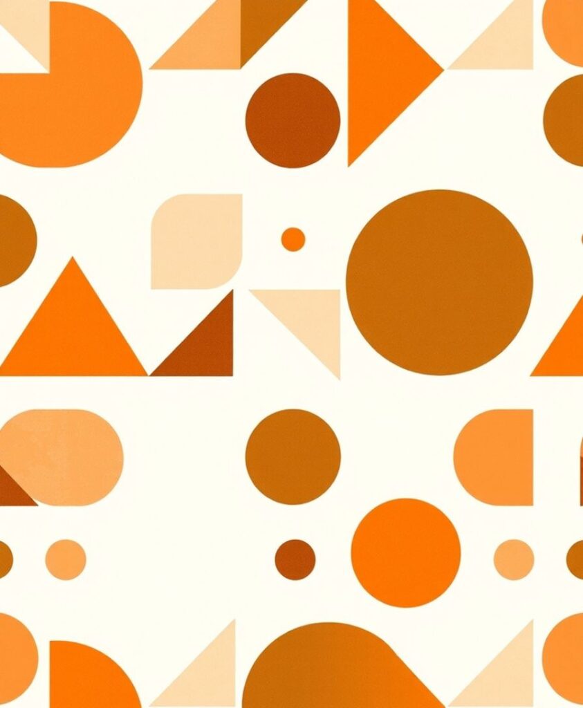
Instead of literal motifs, use the palette of pumpkin spice , soft browns, orange, cream, and beige , to create geometric shapes like triangles, circles, and arcs.
A friend who runs an Etsy store told me this became her best-selling fall digital paper pack because “it matched everything without being too themed.”
2. Autumn Constellations
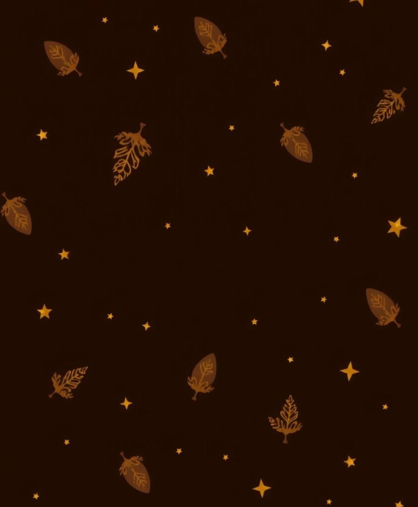
Here’s something unexpected , constellations, but in fall colors. Imagine tiny dotted stars forming subtle outlines of fall motifs like acorns or foxes.
A surface designer shared how this idea sold well because “it connected nature and imagination.”
Where to use: Phone cases, digital wallpapers, or scarves.
3. Crisp Paper Cutouts
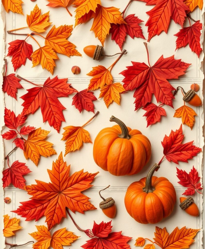
Think of paper collage , rough edges, layered textures, and hand-cut silhouettes of fall shapes.
A design studio in New York used this in a campaign for a stationery brand, and it stood out because it looked tactile, even on digital screens.
Good for: Posters, branding, and social media templates.
4. Woodgrain with a Twist
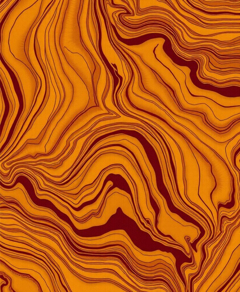
Woodgrain patterns aren’t new, but designers are reimagining them. Imagine golden ochre lines flowing through a soft burgundy base, or stylized rings forming concentric circles like ripples in cider.
One pattern artist I follow sells “digital bark textures” that look hand-carved , and they sell out every fall.
It is best for stationery, apparel, or rustic branding projects.
5. Plaid, But Pixelated
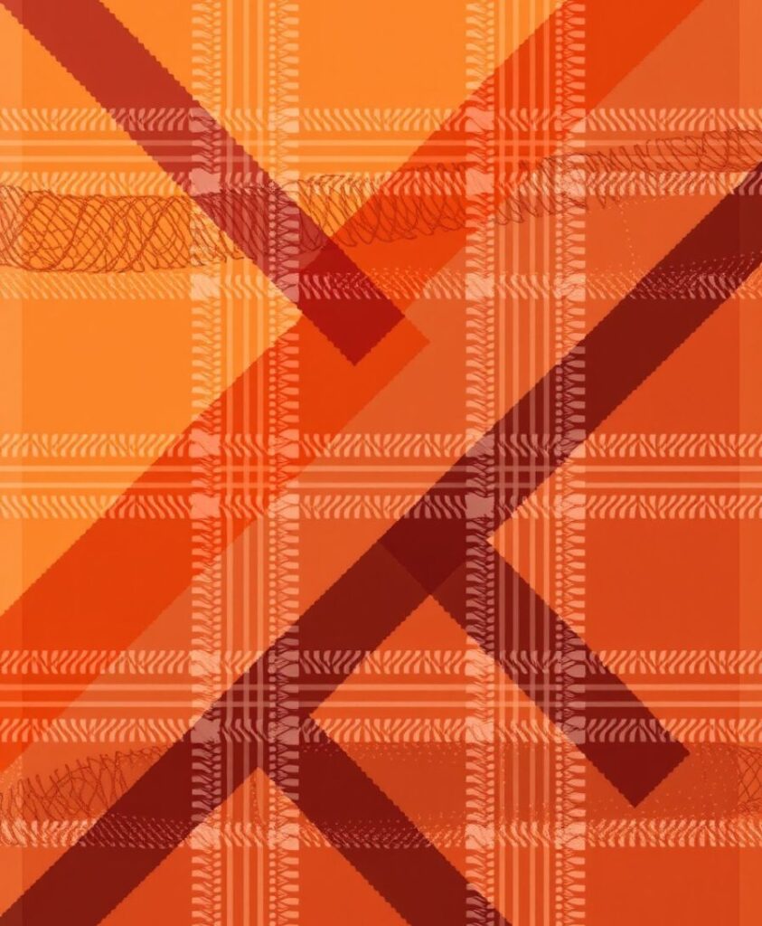
Plaid is the ultimate fall cliché , unless you twist it. Pixelated plaid breaks the lines into soft digital grids, creating a modern-retro hybrid.
I saw this used in a sustainable fashion line where the designer said it “bridged nostalgia with tech minimalism.” It totally worked.
You can try it on fabric design, tote bags, or cozy throw blankets.
6. Fallen Petals & Seeds
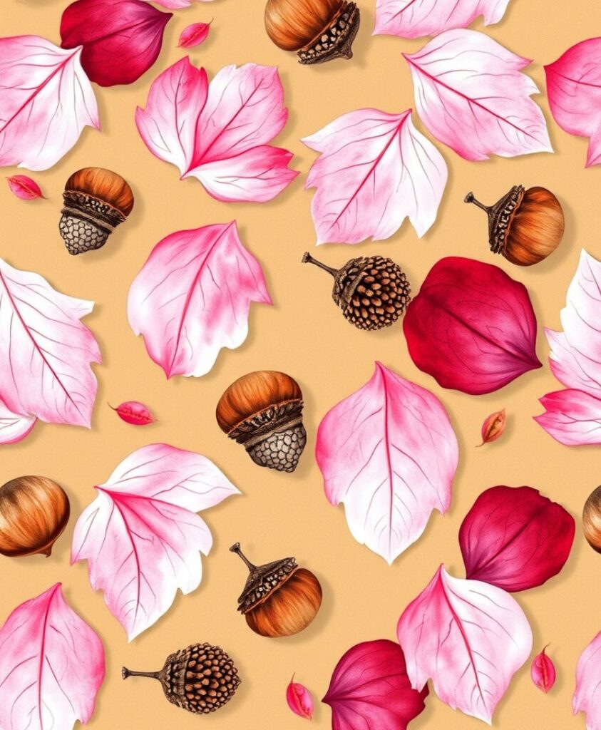
We always romanticize leaves, but have you noticed the beauty in fallen petals, pods, and acorns? A pattern that mixes tiny natural details (like acorn caps or maple seeds) creates a richer fall story.
A local artist here uses this theme in ceramic glazes , soft outlines pressed into clay before firing. The result feels both botanical and intimate.
7. Cinnamon Swirl Abstracts
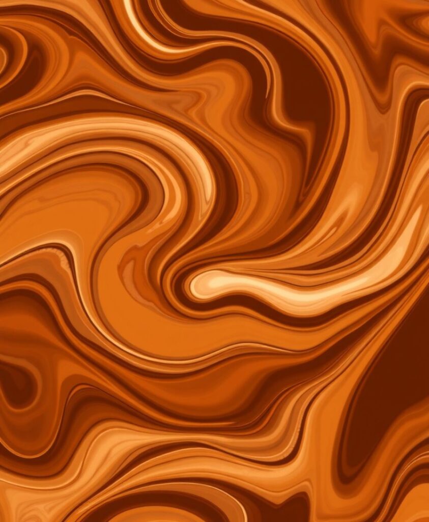
Inspired by the texture of cinnamon rolls and swirled lattes , warm, chaotic, and sweet. Abstract swirl patterns in caramel, nutmeg, and cocoa tones can be both cozy and sophisticated.
A stationery brand I once wrote for used this as a notebook cover theme , they said sales spiked by 20% because “it looked like comfort.”
8. Geometric Pumpkins
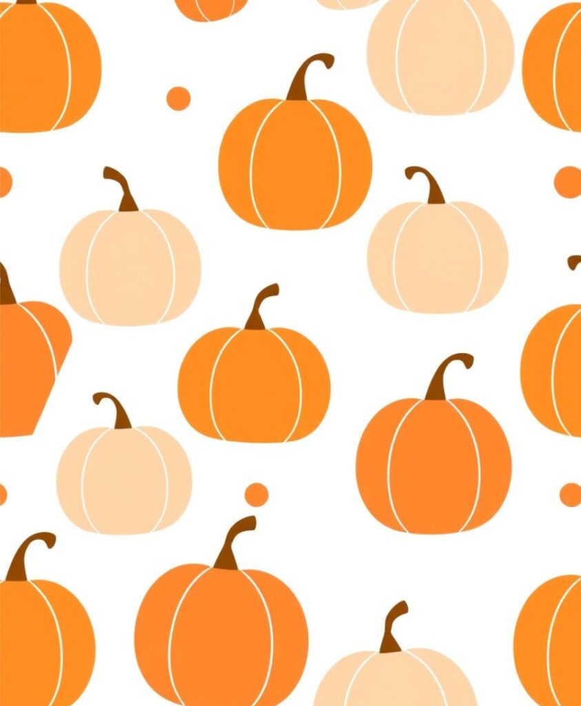
You don’t have to draw pumpkins literally. Try geometric outlines , triangles forming pumpkin silhouettes, minimal contour lines, or repeating segments in deep orange.
It keeps the fall vibe without feeling childish.
Where it shines: Wallpaper, brand packaging, and web backgrounds for seasonal campaigns.
9. Sweater Knit Illusion
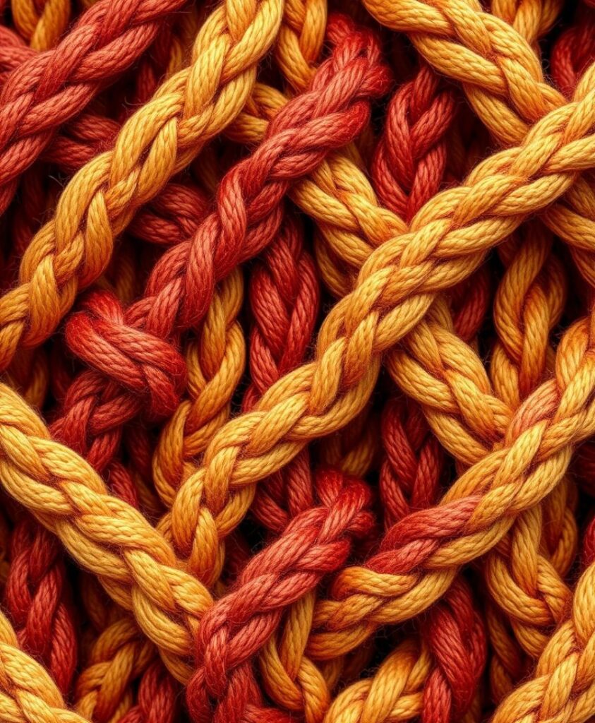
This one’s for those who love tactile textures. Create a digital pattern that mimics a knit weave , like close-up yarn loops.
A designer friend once said she uses blurred edges and subtle shadows to make it “feel” real on screen. Add rusty reds or mustard yellows and it instantly screams cozy.
10. Falling Light (Golden Hour Dots)

You know that dappled sunlight through trees at 4 p.m.? Translate that into a dotted pattern , scattered circles of light gold, warm peach, and muted cream.
A brand I worked with used this as a wrapping paper design; people actually reused the paper for wall art. That’s when you know it’s good.
11. Harvest Basket Weave
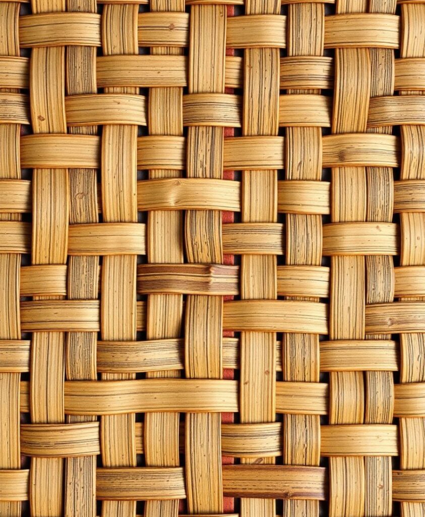
Inspired by the baskets used during apple and pumpkin picking. A crisscross weave pattern, slightly uneven for authenticity, gives that handmade charm.
A print shop in Vermont used this pattern as a reusable grocery bag design , rustic and sustainable, perfect combo.
Here’s a pro tip, you can add grain texture overlays for depth.
12. Moody Florals
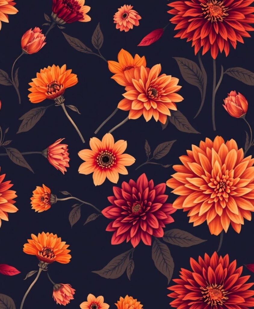
Fall flowers often get overshadowed by spring blooms, but think marigolds, chrysanthemums, and asters.
Dark backgrounds (navy, forest green, or burnt sienna) make the warm petals pop. I once saw a wedding invite with a moody floral background and copper lettering , it felt luxurious yet grounded.
13. Rust-Toned Leaf Scatter
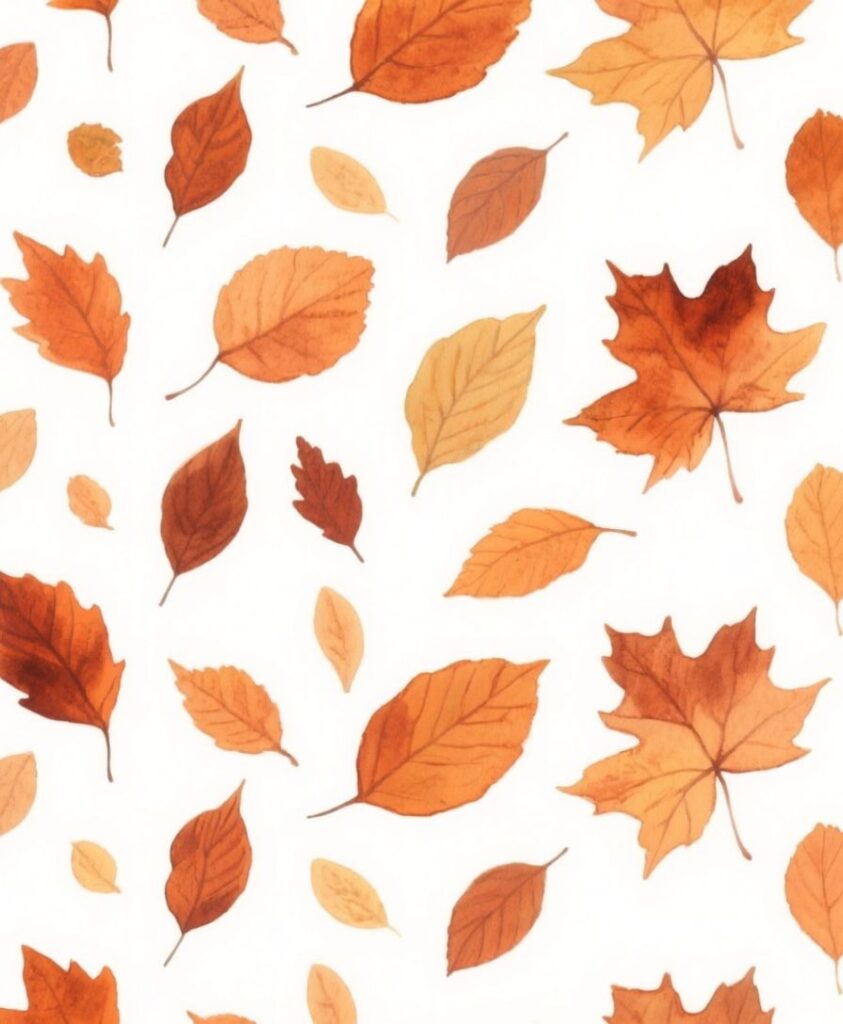
You can never go wrong with leaves, but there’s a trick. Instead of repeating identical leaf shapes, try a scatter effect: varied sizes, slightly rotated angles, and imperfect brush strokes.
My friend Anjali, who designs fabric prints, says this gives the “wind-blown” effect, as if the leaves actually landed on your fabric or background.
You can use it on textile prints, fall wrapping paper, phone wallpapers.
Also see: 18 Easy Fall Leaf Art Project Ideas
14. Misty Morning Gradients

Think of those foggy October mornings , pale beige blending into faded blue and soft gray.
A gradient pattern that mimics mist can make even digital designs feel calming. I once saw a small coffee shop in Portland use this on their cup sleeves , subtle but unforgettable.
Use low contrast and desaturated tones to avoid that overdone “sunset gradient” look.
15. Farmhouse Check with Imperfections
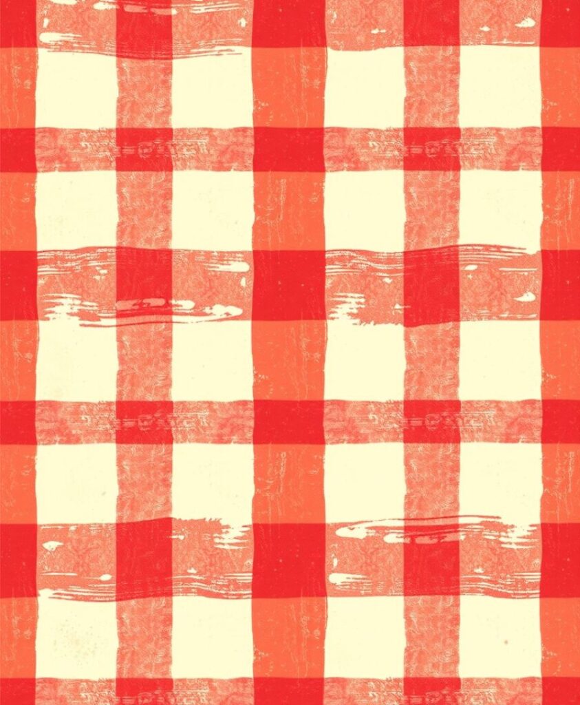
You’ve seen checkered patterns a thousand times, but the best ones? They’re slightly off.
A designer I met at a craft fair said she intentionally paints uneven lines with a wide brush, then digitizes it. The result feels alive , like a handmade quilt.
Perfect for: Textiles, kitchen accessories, or rustic home décor.
16. Faded Storybook Illustrations
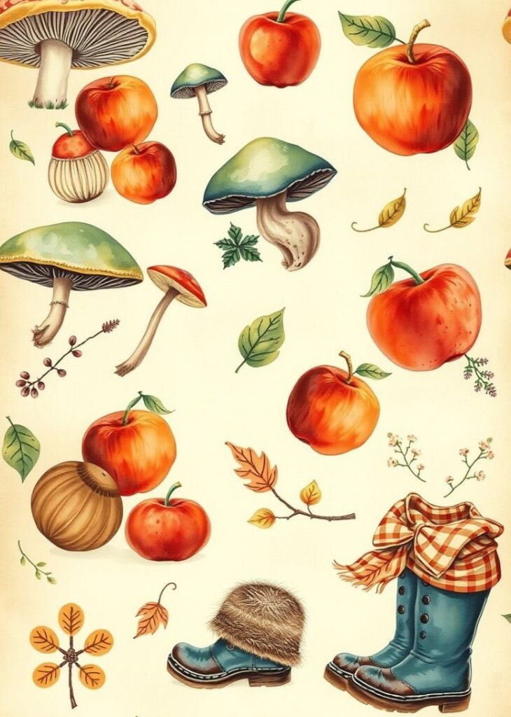
Finally, my personal favorite , patterns inspired by vintage fall storybooks. Think faintly illustrated mushrooms, apples, boots, and scarves, arranged like old wallpaper.
A children’s illustrator once told me she textures her drawings with scanned old paper to achieve that “memory feel.” It’s subtle nostalgia that works across generations.
Bonus Insight: What Makes Fall Patterns So Irresistible?
It’s not just the color palette (though ochres, browns, and golds do half the work). It’s the emotional pull , fall patterns remind us of slowing down, warmth, and sensory experiences like crunching leaves or sipping something hot.
Designers know that seasonal sentiment sells, which is why even big brands shift their entire aesthetic around it.
Take Anthropologie or Rifle Paper Co., for instance , their fall releases often rely on textural depth and muted contrast. Nothing screams fall louder than something that feels real , textured, imperfect, and layered.
So next time you’re designing something seasonal, try blending familiarity with surprise. Mix your cozy flannel checks with abstract fog gradients.
Pair a moody floral with a crisp paper-cut texture. The best fall patterns aren’t just visual , they’re emotional.
Which of these pattern ideas do you think you’d try first?