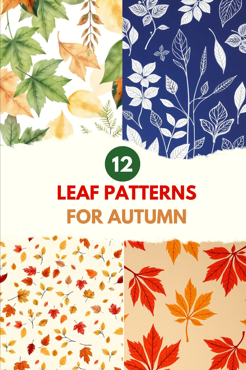
Autumn leaves are the kind of quiet show-off nature does without trying. They change color, fall in interesting ways, and make patterns that look great on everything from tea towels to high-end wallpaper.
Below are 12 leaf-pattern ideas that go beyond the usual maple-repeat.
I’ve used several of these in client projects, sold prints, and ruined more than one white shirt in the name of research.
So this is practical, not theoretical. Ready?
Also see: 16 Fall Themed Pattern Ideas to try this Season
1. Single-Leaf Portraits (large scale)
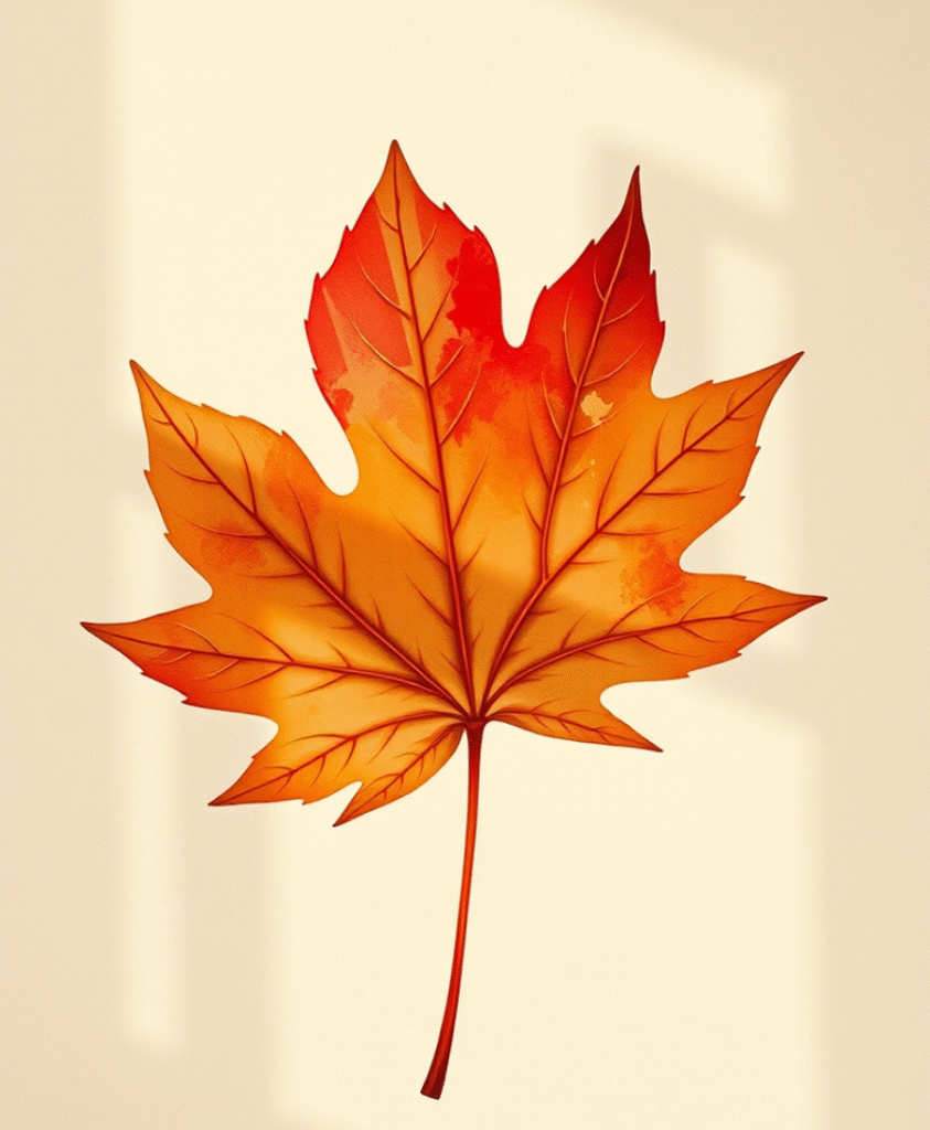
Think big. Take one leaf, a sycamore or ginkgo with a bold silhouette ,and make it the star. Center it on a page, add slight texture, maybe a watercolor wash, and let it breathe with lots of negative space.
Why it works: Large motifs read well at a distance, perfect for posters and cushions. In a project for a boutique hotel lobby, the oversized oak-leaf prints created a calm focal point and reduced the need for extra decor. Pro tip: vectorize the silhouette for sharp printing at any scale.
2. Overlapping Translucent Layering
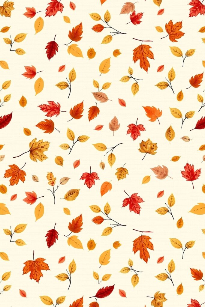
Use multiple leaf shapes with low-opacity colors so they overlap and create new tones where they meet. Think stained-glass, but organic.
Use case: Stationery and greeting cards. This technique gives depth without heavy detailing. When I used this for a seasonal card line, customers loved the subtle color blends; it photographed beautifully on social media.
For print, ask your printer about ink trapping, overlapping translucent effects sometimes need special handling.
3. Botanical Blueprint (line + negative)
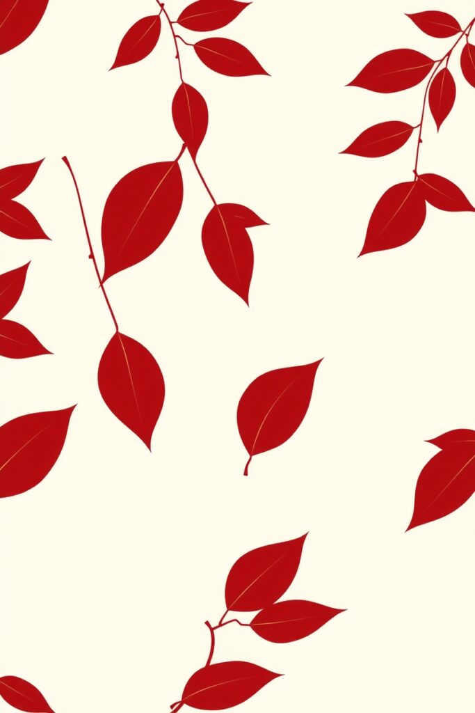
Strip leaves down to contour lines and veins, place them on a flat contrasting background. Keep scales consistent and use a limited palette ,navy and cream, for example.
Why designers like it: It’s modern, clean, and translates well to textiles. Also great for laser-cut lampshades because the veins become cutouts. Quick tip: export vector lines in a single stroke weight for predictable laser cutting.
4. Pressed-Leaf Collage (photo-texture)
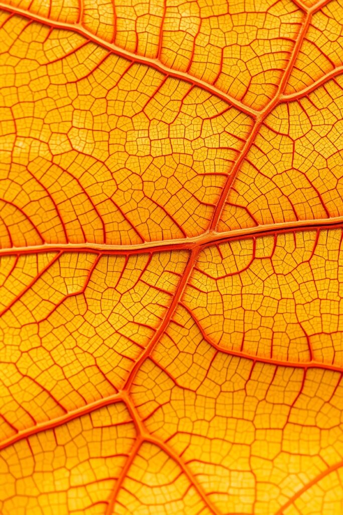
Scan real leaves at high resolution and create collages, overlapping, mirrored, rotated. Keep the scans slightly imperfect; the little holes and tears add character.
Real-world note: I scanned leaves from three different parks to get texture variety. Clients repeatedly asked if the leaves were real because the scans preserved tiny fungal speckles and insect marks.
If selling commercially, be mindful of copyright on very distinctive botanicals, not common, but worth a check.
5. Repeating Rhythm Stripes
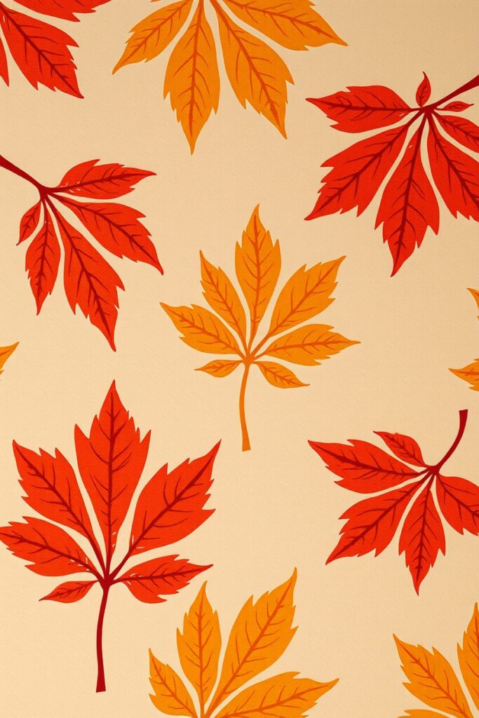
Create narrow vertical stripes formed by repeating tiny leaf motifs. Vary orientation and spacing to give rhythm instead of monotony.
Great for: Apparel and upholstery. Narrow stripes elongate and flatter. In one small collection for a knitwear brand, this pattern made a sweater more versatile and increased sales across age groups. When tiling, pay attention to repeat height for seamless knitting patterns.
6. Negative-Space Motifs
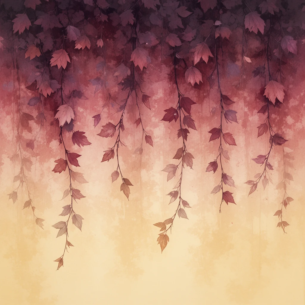
Design leaf shapes by removing them from a filled field, the leaf becomes the absence. The contrast can be punchy and modern.
Where to use it: Wall murals, ceramic tiles, and greeting cards. Negative-space patterns often read as geometric at a distance, which is a fun surprise when you get closer and see they’re leaves.
7. Tiny Sprinkles (ditzy pattern)
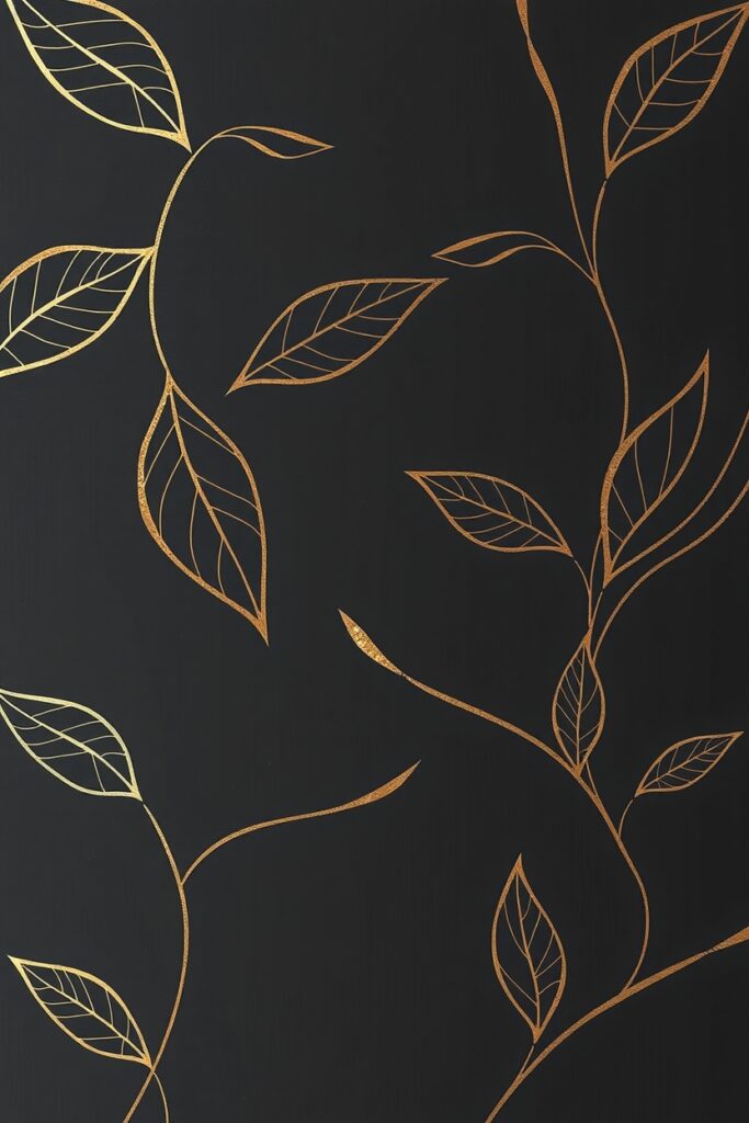
Make a tiny, randomly spaced leaf motif, like confetti. Use three or four small leaf types and rotate them freely.
Why it sells: Ditzy patterns are unisex and scale-friendly. They’re low-commitment, works on pajamas, kids’ tents, and phone cases. For printing on fabric, test small repeats first; density can affect stretch and hand.
8. Vein-Focused Textures
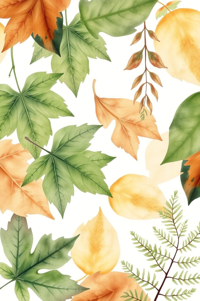
Zoom into a leaf’s vein structure and repeat that as a texture. Scale and crop for an abstract, lace-like effect.
Industry insight: These translate beautifully to emboss and deboss processes on paper goods. A textured shop card using an embossed vein pattern feels luxe and costs surprisingly little compared to foil.
9. Seasonal Color Gradients
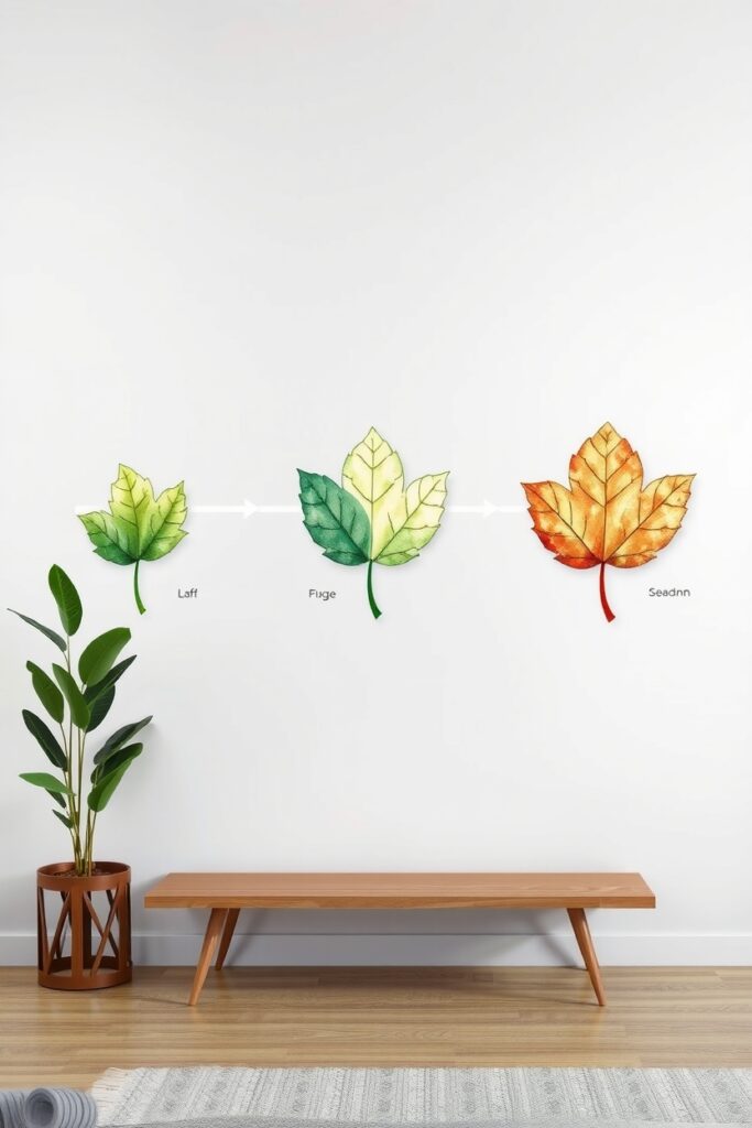
Make gradients that follow leaf veins or silhouettes, warm red to deep gold, for example. Use gradients subtly, not as a full-spectrum rainbow.
Application: Digital backgrounds, website headers, and packaging. Gradients add motion. For CMYK printing, convert your gradients to smooth halftones and ask for a high-resolution proof because banding can surprise you.
10. Two-Tone Block Prints
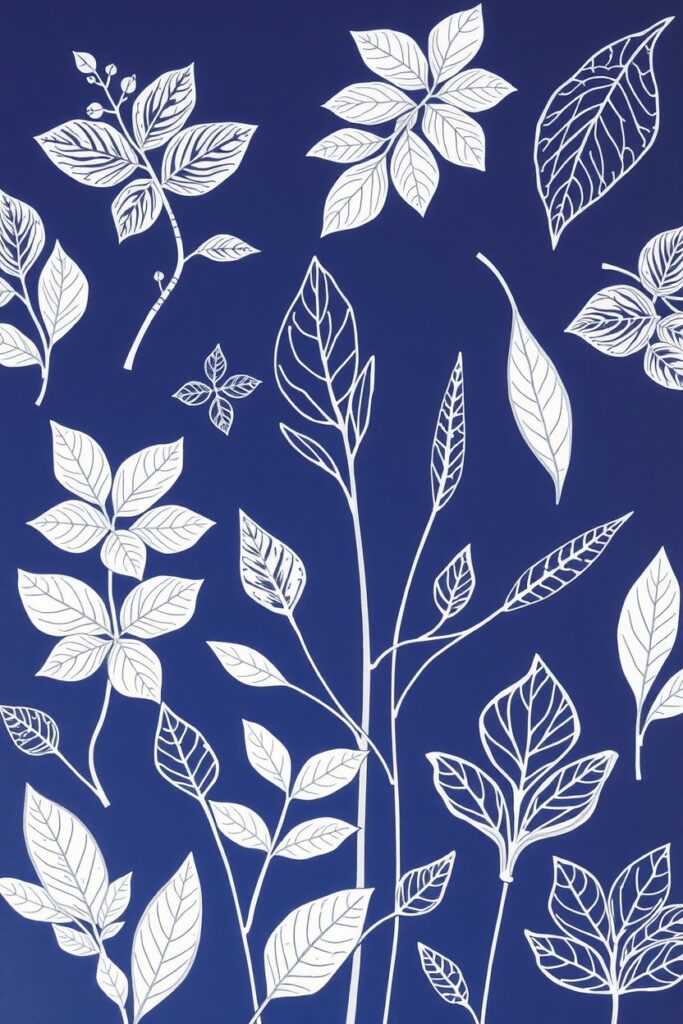
Use bold, two-color blocks where leaf shapes are cut out, like old-school linocuts. High contrast, tactile feeling.
Why try it: Block prints have personality and are production-friendly for limited runs. I taught a workshop making two-tone leaf prints on tote bags; people loved that the imperfections made each piece unique. For repeat products, digitize the best prints and clean up edges to preserve charm without noise.
11. Motion Trails (leaf in flight)
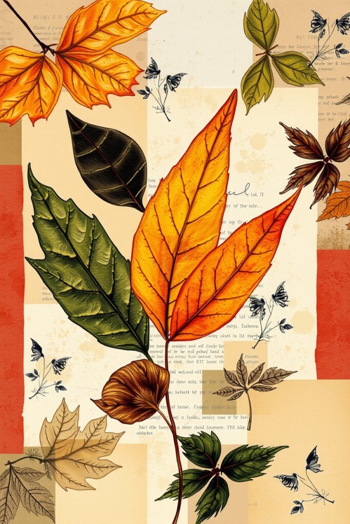
Design patterns where leaves have motion lines or faint shadow repeats, as if being carried by wind. Make the trails curve to create flow across the repeat.
Useful for: Scarves and long fabrics, where movement in the pattern complements the garment’s drape. In one scarf collection, motion trails kept the print visually interesting when folded or knotted.
12. Geometric Grid + Organic Leaf
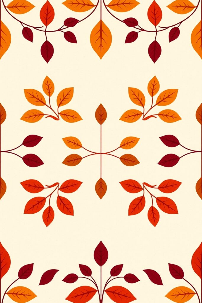
Place organic leaf shapes within a strict geometric grid. The tension between rigid and organic is visually satisfying.
Production tip: Use a modular grid and test both centered and slightly off-center placement inside cells. This approach gives designers flexibility to scale pattern density for different product sizes without losing the grid’s rhythm.
Quick workflow recipe (for a repeatable pattern)
- Choose 2 to 4 leaf species as assets. Scan or draw them.
- Clean edges in vector software. Keep one high-res raster for texture.
- Arrange on a repeat tile. Test the 4-way or brick repeat for best flow.
- Mock it on the product (a pillow, a dress, wallpaper).
- Get a print proof, check color on the intended substrate, then go to production.
I always create at least three mockups: small scale, medium, and large. It uncovers problems you won’t see on a flat tile.
Color notes: autumn palettes that actually work
- Warm dusk: burnt sienna, mustard, deep olive.
- Soft decay: muted mauve, grey-green, ochre.
- Jewel tones: crimson, teal, amber (good for luxury collections).
- Monochrome: sepia or navy with cream (timeless).
One rule I often use: pick one dominant color, one accent, and one neutral. That keeps things coherent and scalable.
Production and technical pointers only an industry insider would whisper
- Vector vs raster? Use vectors for silhouettes and repeat edges. Use rasters for texture and scanned elements. Combine them in layered files.
- Print repeat size matters. For knits, choose a smaller repeat; for wallpaper, go larger.
- Color separations: if you want metallics or spot colors, plan for extra plates. Metallics look incredible on leaves; they also increase cost.
- Textile dyes vs digital print: dye-sublimation is better for vibrant gradients and all-over prints, but fabric choice changes color perception dramatically. Always order swatches.
- File naming and margin: name your files with repeat dimensions and DPI. Include bleed and safe area markers for printing.
I can remember a case study you should listen to. I once worked with an indie stationery brand launching a fall collection. They picked idea 2 (overlapping translucent layering) and wanted it on cards and a limited-run wrapping paper.
We scanned maple and beech leaves, created three layered colorways, and ordered an initial 300-sheet run. Sales data from the first month showed the translucent designs converted 40 percent better on social ads than the brand’s usual flat-illustration cards. The takeaway: subtle depth sells.
Final thoughts
Leaves are versatile. You can go illustrative, minimal, bold, or quiet. Try mixing techniques ,pressed-leaf texture with vein-focused embossing, for example.
And if you only take one thing away: always test patterns on the final product at real scale. Patterns can surprise you once they wrap, fold, or repeat.
Want a quick mockup suggestion for one of these ideas? Tell me which design you like and what product ,I’ll sketch a mockup plan you can hand to a printer or a maker.