
Sun. Sand. Sweat. Sketchbooks.
Every summer, I find myself chasing the feeling of golden afternoons, those moments when the light hits just right, shadows soften, and everything glows.
That glow? That’s what your summer color palette needs to capture.
Creating a summer palette isn’t just about grabbing a bunch of bright colors and hoping they work.
There’s rhythm, contrast, and exactness in how summer looks, and we’re going to break it down simply, step by step.
Let’s go ahead.
What Even Is a Summer Color Palette?
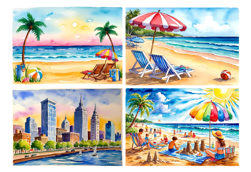
At its core, a summer palette is a collection of colors that evoke the mood, light, and textures of the season.
Think of it like building your travel bag:
- A few bold pieces (that cherry red shirt)
- Comfortable neutrals (your go-to linen)
- And something playful, like those aqua earrings you wear once but never forget.
Your colors should feel fresh, bright, and a little nostalgic, just like summer itself.
Also see: 21 Blooming Nature Drawing Ideas
Step 1: Understand What Makes Summer Colors Special
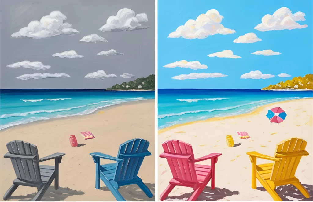
Let’s not hide anything; if you’ve ever tried to paint a beach scene and it looked like a kids’ color fight, you’re not alone. I’ve gone through it.
Here’s what makes summer colors a big “Yes”:
1. Bright, diffused light: It softens borders and shifts how we sense colors.
2. Nature-driven hues: Sky blues, leafy greens, sandy neutrals, and the coral-pinks of blooms.
3. High contrast with soft transitions: Deep colored foregrounds with misty horizons.
So, in simple words, color temperature is essential:
Warm tones, such as coral, terracotta, and butter yellow, bring heat. Similarly, Cool tones like Aqua, seafoam, and lavender skies balance it out.
Summer is about contrast and harmony. That’s the tightrope walk.
Step 2: Pick Your Core Colors (Don’t Overthink It)
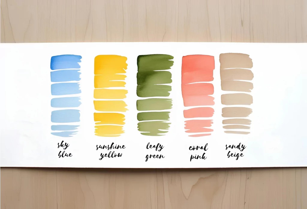
I always start by choosing five base colors that give me the vibe. Here’s a classic lineup you can’t go wrong with:
- Sky Blue – evoking cloudless days
- Sunshine Yellow – pure warmth
- Leafy Green – vibrant but grounded
- Coral Pink – floral, flirty, fun
- Sandy Beige – because neutrals are the glue
Add to that a few trending shades if you like to stay current (according to Pinterest’s 2025 Palette):
- Cherry Red – punchy and bold
- Butter Yellow – a gentler version of sunshine
- Aura Indigo – moody contrast
- Cozy Latte – that mocha-brown warmth everyone’s using
- Pickle Green – yes, it’s real and surprisingly delightful
I once built an entire palette around just one wall tile I saw near a beach, a faded teal with rusted orange borders.
Step 3: Create Your Own Palette
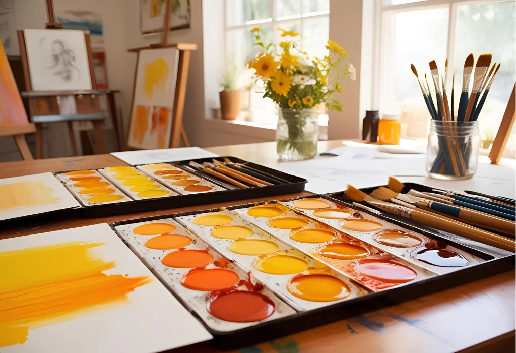
1. Choose a “Hero” Color
This is the dominant color in your piece or design. For beachy scenes, it’s usually blue. For summer florals? Coral or warm yellow.
2. Add 2 or 3 Supporting Colors
These play side roles — they add harmony, variation, and interest.
Example: Hero = Sky Blue, Supports = Butter Yellow, Pickle Green, and Coral Pink
3. Anchor with a Neutral
Use something like Sandy Beige, Mocha Mousse, or a faded off-white (Titan Buff) to balance the vibrancy.
Test this combo on paper before you commit. Swatch it, sketch a rough scene, or even collage with swatches if you’re not ready to paint.
Step 4: Play With Media (It Matters!)
Your palette behaves very differently depending on your medium.
Acrylics?
- Great for beaches, bold shapes, and texture
- Use a palette knife to create sandy effects.
- Mix medium white + violet + yellow = beachy beige.
- Try layering phthalo blue with titanium white for ocean depth.
Watercolors?
- Perfect for dreamy skies and delicate flowers
- Use wet-on-wet for sunsets (Rose Dore + Ultramarine Violet)
- Layer transparent washes like Sea Glass over light yellows for sunlight
Gouache?
- Think vibrant florals, patterns, bold blocking
- Use flat washes for petals
- Dry brush for details like leaf veins or fruit texture
My gouache florals always start with a warm yellow base and end with aggressive pink dotting. It’s chaos until it isn’t.
Step 5: Try a Mini Project (Trust Me)
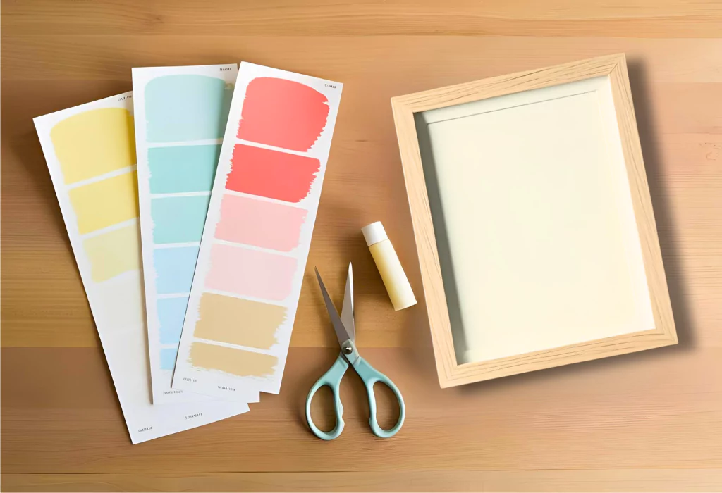
Let’s put this to the test quickly.
Paint Swatch Art (A Summer Workshop Favorite)
What you’ll need:
- Paint swatches (free from hardware stores or print your own!)
- Scissors
- Glue and a frame
Steps:
- Pick 5–6 summer colors in a gradient (e.g., pale yellow to coral pink)
- Cut into triangles or squares
- Arrange in a sunburst, wave, or spiral pattern
- Frame it. Done.
It’s low-pressure, teaches color balance, and looks legit on a wall.
Avoid These Summer Color Fails
Even pros slip up. Here’s what to watch for:
- Too many bright colors bring chaos: Keep bolds in check with grounding neutrals.
- Pure white everywhere: It can look stark. Try Titan Buff or a warm off-white instead.
- Forgetting depth: Use layers and shadow mixes (add Raw Umber or Violet) to give scenes realism.
Fun fact: Summer isn’t always saturated. A hazy, washed-out look (think vintage beach photos) can sometimes capture it better than full-on saturation.
A Quick Mnemonic to Remember Your Summer Palette
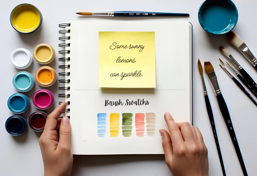
Ever stare at your paint tubes like you’re solving a Rubik’s cube? Same.
Here’s a trick I tell everyone (and honestly, still use myself):
“Some Sunny Lemons Can Sparkle.”
It stands for: Sky Blue, Sunshine Yellow, Leafy Green, Coral Pink, Sandy Beige.
It sounds a little ridiculous — and that’s exactly why it works. Your brain remembers weird stuff way better than it remembers logic.
This five-color cheat phrase gives you an instant summer palette that just works.
I keep mine scribbled on a sticky note in my sketchbook. No shame.
So next time you’re mixing colors and feel stuck, ask yourself:
Did the lemons sparkle?
If yes, you’re probably on the right track.
Final Thoughts: Summer Is a Feeling
The perfect summer palette isn’t perfect. It’s a little messy, a bit spontaneous, and totally mood-driven.
Some days, your palette is all ocean blues and soft violets. Other days, it’s watermelon reds, leafy greens, and that weird light you only get at 6:45 pm.
That’s okay.
Your job? Capture it — one color at a time.
Now go open your sketchbook and ask yourself:
What does your summer look like today?
As always, comment below on your opinion about the summer color palette. Was this post useful for you?